Every sip had a magic sprinkled in it. Sitting at the elegantly designed dark wooden table, I took a sip of the coffee. The aroma was enticing, the texture was perfect and the coffee mug has this mysterious looking logo on it! Well, I was at Starbucks!
You would probably be reading this because, like me, you might want to decipher what the logo has to speak? What is this beautifully looking creature on the logo? Does that look the same when it was created?
It is mysterious to find out that a classy looking figure on the world’s best coffee firm’s entrance and on its cups actually meant addiction, obsession and death! Scary but true. The Starbucks logo is known to be one of the world’s most appreciated logos. Is it a mermaid on the logo or a siren? People debated a lot and ironically both won the game. But how?
Simple to superb- rise of the Starbucks!
The birth of Starbucks took place in 1971, on 30th of March, as a coffee bean roaster and retailer in Seattle, Washington state. Initially the firm used to sell equipment for making coffee and also good quality, expensive coffee beans. Later they turned out into a small coffee house and branched out from their original business. From desserts to coffees, scones to cappuccinos, Starbucks has constantly been changing the menu with fascinating and tasty beverages and foods, thus luring the taste buds. It has dominated the coffee market across the world and turned into the power house for all those who love coffee.
The world’s biggest coffee chain is headquartered in Seattle, Washington. It is spread across the world with more than twenty thousand stores in sixty two countries. The firm owns assert of 8.21 billion US $ as calculated during 2012. It also employs 149,000 people across the world.
The enticing story:
Millions of people got seduced and addicted by the luring taste of coffee on the table; the Starbucks speak proudly. Buying the coffee again and again for the flavor and for the taste of love by its consumers worldwide, the logo seriously suits the coffee. The woman in green with the stylish fish twin-tails is actually a siren as mentioned in the Greek mythology.
Going back to the day the logo was designed, the firm was looking for a marine theme to seizure the spirit in Seattle. During 1971, Seattle was known for the seaports and sails rather than the rain, rocks and hipsters. According to the mythology, the sirens are the mysterious reflections of the huge ocean. They used to sing a melancholy sweet song that pulls sailors crossing by. The sailors get so obsessed with the song that they unknowingly hit the rocks and die in the ocean. Really? …Many believe!
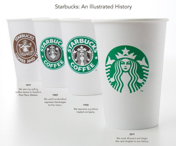
Come, let’s unfold the evolution of Starbucks logos:
1971 – 1987:
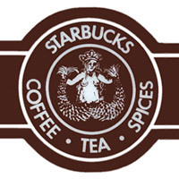
This woodcut logo which looks like of the old 16th century is a siren or a twin-tailed mermaid that represents the store Starbucks, tea, spices and coffee. This logo created during 1971 meant to seduce just like the siren or the bare bodied rubenesque as the coffee itself does.
1987 – 1992:
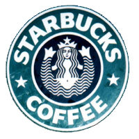

It was the time when the two companies and two cultures got mixed to brew a new taste. Starbucks took over another Coffee shop chain ‘Il Giornale’ . This was the new logo representing the merger of the two firms. The new Starbucks logo was made more contemporary and has took the lime light amoung the brand designs. The traditional brown color changed into the Il Giornale’s strong green color. During 1987, when this biggest coffee brand was took over by an American businessman, Howard Schultz, the logo has undergone few changes. Yes, bare body of the mermaid was covered with the graceful hair. The color green is added to the logo to enhance the growth, uniqueness and freshness in every sip of coffe at Starbucks. And, the handcrafted espresso beverages were introduced in the menu. The changes lead to development of the brand.
1992 – 2011:
Later during 1992, the mermaid was seen from a close up. The navel part of the picture got disappeared and the logo was zoomed in.
2011 – and beyond
Again, in 2011, on the firm’s 40th anniversary, a new logo was introduced. The redefined logo looked revised and faced lot of criticism from many people and even design experts. However, From mainland China to the streets of India, everyone recognizes this logo. This new interpretation of the logo offers you a freedom to imagine beyond coffee. Starbucks will continue to stay as the world’s best purveyor that offers world’s best coffee.
The mystery gets unfolded here; witness the video on the enticing mermaid and how it has changed its appearance over the years.
Here’s a fabulous video that helps you decode the artistic mystery behind Starbucks logo: https://www.youtube.com/watch?v=_APClZ0NrYE
←click on the infographics to expand
Has the logo fascinated you so much? Just the simple coffee house at the street corner has a long history to speak. This is the logo that made the tall difference to the art admirers and coffee lovers around the globe.
All Intellectual Properties referred on this website are absolutely owned by their respective owners.