If I say the world is so small, would you accept it or debate?
But the Discovery Channel has turned things that way. It has showcased the huge world in a small TV! It has helped us discover the world while we stay where we are!
About ‘The Discovery Channel’
Formerly known as ‘The Discovery Channel’ and now known as ‘Discovery Channel’, is an American cable television and satellite channel. It primarily focuses on technology, popular science and history documentary programming. It is John Hendricks who took a mortgage to fulfill his dream cable network project that he started in 1985. It was launched in Landover on 17th June and later shifted to Silver Spring.
Various established groups like Venture America and BBC have put a combined effort to start a 5$ million dollars firm, The Discovery Channel during 1985. In the very beginning, the channel had a reach of 156,000 people only. Even its programming was limited. Though today, it owns millions of audience and several successful television shows. Few of its best admired shows include, Deadliest catch, Dirty jobs, Mythbusters, Monster Garage, Man Vs Wild etc. and still the urge to watch in the viewer’s heart is strong! Tickle your memory, what was your favorite show in the channel?
With more than 40 offices across the world, 13 channels, 5000+ employees, 28 entertainment brands, 1.5 million subscribers, Discovery Channel is a flagship station of Discovery Communications Inc. It is during 1990’s, the Discovery Communications started to take the speed. It has acquired ‘Animal Planet’ in 1995 and ‘The Learning Channel’ in 1991.
The discovery of the Discovery Channel Logo!
Of course, the logo takes the pride for the heights the channel has reached. Its distinctive look has created the brand and its identity. It has shaken hands with its customers and represented the firm. It is the iconic logo of the globe that reminds ‘Discovery Channel’ every time we come across it. The channel is popular among its audience for its quality entertainment.
During 1987, a broadcast design studio from Boston has launched the channels first on air package. The team was led by Ron Pearl, the creative director of the design group. Greg Moyer was the marketing and creative head of Discovery channel .This network package has won BDA best of Show Award in 1987.
The motifs of ‘The Discovery Channel’ from then to now:
Year 1985 – 1987:
In the first logo, the channel aimed at displaying the world to its viewers at their living room, thus the logo represents a motif of a TV Screen. They have got this box shaped logo that looks like a television. Within this TV is a flat globe in black and white. This logo has served the symbolic purpose of ‘showing everyone the world at the comfort from their living room’. Below the reverse image, the text ‘The Discovery Channel’ appeared. This was to strength the channels dedication to help people discover the world.
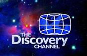
Year 1987 – 1995:
In not more than couple of years, a new logo was launched. The globe is freed from the television box. A half globe was used and the text is strengthened. The globe used to intersect the letters of ‘Discovery’.
For the period 1988 to early–1995, the world witnessed this logo of The Discovery Channel in variant shades.
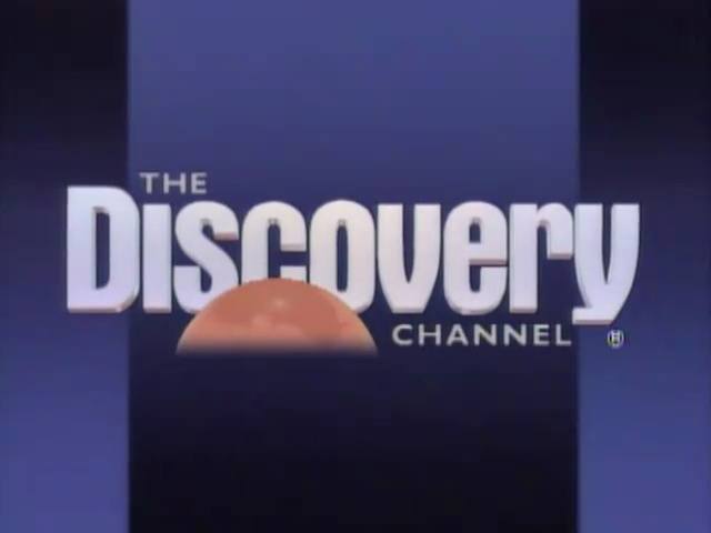
Year 1995 – 2000:

In 1995, the time has come when ‘The Discovery Channel’ has turned into ‘Discovery Channel’. On the 19th of September, 1995, this new logo was introduced. The semi circle of the globe was swapped and ‘THE’ from the text was removed. A new tag line was introduced too; ‘Explore Your World’.
The newly-replaced logo had few tweaks. The text ‘Channel’ slide into the strap. Even the global icon was changed to throw more lime light on the Pacific Ocean than any of the continents. Did you notice that the America is seen towards the right and the Australia towards its left?
Year 2000 – 2008:

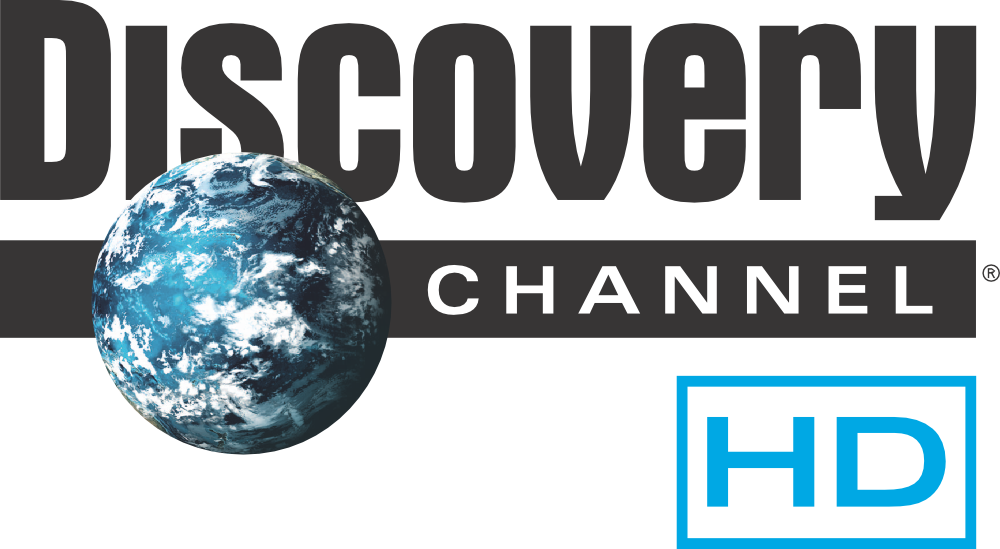
The HD, high definition logo of ‘Discovery Channel’ was introduced to the world on September 22, 2007. Well, guess the creative head still felt the need of change with time! Thus, altered it in April 2008 along with the new main logo!
Discovery Channel has won many awards in continuous years. As per the study carried out by the Broadcast/ Base cable Networks, Discovery Channel has earned the number one ranking and people call it their favorite channel. It is called both an informative and entertaining.
“We are very proud to have a network experiencing such ratings success while remaining strongly committed to quality—a rarity in TV today, We remain committed to delivering the most unique and captivating programming possible at Discovery Networks for the enjoyment of our viewers and the benefit of our distribution partners.” – Bill Goodwyn, President, Domestic Distribution and Enterprises, Discovery Communications.
Year 2008:
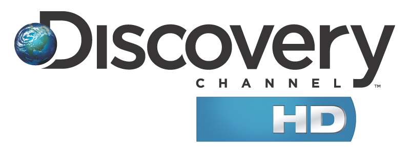
As planned, the new logo was launched on April 15th, 2008. Viewpoint Creative took the pleasure to design this logo. They are also the new graphics of the channel. Along with the logo, Viewpoint Creative has offered a tag line to the firm, ‘The world is just awesome’. It kicked up a marketing campaign too that took a huge popularity. It was developed by ‘72nd and Sunny’.
Now, eyeing on the logo design, the globe shrunk a little and it was modified with brighter colors. The strap was removed and also the font of the text is changed!
Year 2009 -present:
 This time, the re-branding was given to the creative professional group ‘Royale’ . The globe was modified again but the logo looks were altered very slightly. ‘Channel’ looks little bigger now. This re-branding in 2009 made a difference and a new logo was added to the taste in 2013.
Year 2013 – present:
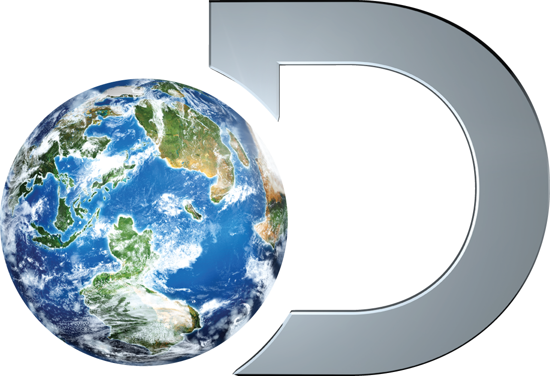
During the mid 2013, Discovery Channel felt the ‘huge’ world is completely aware of the channels ‘small’ world! They began emphasizing the earlier logo with a motif rather than a text. They decided that ‘D’ and just the ‘globe’ would represent their brand and nothing else! ‘Discovery’ used to be written underneath for social media and for print. It even came up with a new tag line, ‘Grab life by the globe’.
The logo that made the difference!
This new ‘D’ logo looks contemporary and creative! Here comes another firm that represents itself with a motif rather than a lengthy word or text. The years of branding and campaigns has ripped the fruit. It is actually difficult for the world to remember your firm by just a motif. Everything about the logo design is well resolved. I really feel ‘Discovery Channel’ has owned a successful identity alike the world it shows to the world. After all, it is the small world that made a huge difference.
With a massive viewers and fans base, there is no doubt that the logo has worked! The stylish globe logo depicts exactly what the firm stands for. Bringing the world to the living room of people has easily carried out by this creative logo. It speaks to the people across the world, entertaining and educating their viewers. It of course will remain the power house of knowledge for the years to come!
Added feathers in the network…
During 1990’s, the firm started to grow its wings. Many new networks have been launched. Many sister channels have come up that used the similar logo designs as Discovery Channel. The globe and the typeface appeared similar in these channels like in the original Discovery Channel. The networks include travel channel, Animal Planet, Discovery Science, Discovery Wings, Discovery Kids, Discovery Home and Leisure and TLC. Out of the lot, the designs of motifs that appeared similar to the parent Discovery are placed below.
Animal Planet:

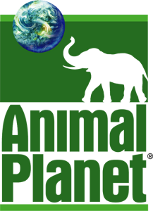
This channel is launched during October 1996 as a venture of Discovery Communications and British Broadcasting Corporation. The Logo of this channel too contain the Globe-aspect of the Discovery Channel.

In February 2008, Animal Planet was re-launched. As part of its new branding campaign, the globe and elephant is replaced with a more striking text logo.
Discovery Science:
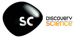
Discovery Science, known as ‘Science Channel’ today is a US television network which is mostly based on science programs.
Discovery Turbo:
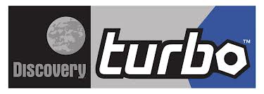
It is also known as Planet Green, Discovery Real time and Discovery Turbo (Asia). The channel is oriented on cars, boats, planes and bikes news. I is launched on 22 September 2008.
Discovery Home and Health:
![]()
This channel is based in U.K. It is owned by Discovery Networks Europe and Discovery Communications.
What we discover out of the Discovery? With the huge space in our knowledge society, the Discovery Channel keeps up it’s dominance and prominence worldwide with it’s unique taste and touch on each of it’s program. Enjoy the discoveries!
All Intellectual Properties referred on this website are absolutely owned by their respective owners.