Remember the ‘open happiness’ campaign? Who does not! It is Coca-Cola! Open the lid and happiness bubbles out. This bottled happiness is shared around the world for 125 years. Throughout the years the coco-cola trademark had interesting changes in its logo. From simple black colored curves in 1887 to added swirly script in 1890’s, there are many!. The trade mark sign in the tail tweaked in 1940’s. The fishtail plate in 1960’s changed to the famous white wave and later into a name in 1969. During 2003, the added extra waves and the bubbles were found in the logo. Back again to the retro classic standard look in 2007 and finally to the happiness bottle in 2011. Coca-Cola has been welcoming with different perspective logos being truthful to its original taste and also making numerous contemporary tastes thought the years. But what is this medicine Vs soft drink story?
The medicine that cured the pain
During the late 19th century, a pharmacist cum war veteran named John Pemberton was terribly wounded in the battle of Columbus. Just like many other wounded veterans, he got addicted to morphine, a drug that eases the pain. It was highly used for sedation. Being a pharmacist, he tried to invent an analogue. Hence he started his experiments on coca leaves and kola nuts after reading the positive uses of coco in a daily. He decided to have a substitute for morphine demand with caffeine and cocaine which was found plenty in the tropical fruits. Finally, the world famous drink took birth in Columbus, Georgia in the backyard of John Pemberton on a brass three legged kettle. He called this patent medicine as Pemberton’s French Wine Coca.
Frank Robinson, his book keeper gave the name Coca-Cola by means of the ingredients used for making it. Later he got a patent for the secret formula and sold it to Asa Griggs Candler, the business tycoon whose fortune changed and coco-cola became a popular drink in America through his extensive marketing and advertising strategies. The soft drink was first sold to the public at the soda fountain in Jacob’s Pharmacy in Atlanta on May 8, 1886.
The coca cola curves
I bet you must have tried your name just like the coca – cola curves on the paper. The two words in cursive letters has been the famous brand till now. It can be recognized by 94% of the world. Even the kid walking by, would identify it as his most favorite carbonated drink with a straw to sip all the way shopping his stuff. Pemberton’s bookkeeper Robinson who also had an excellent penmanship gave curves to the coco-cola logo that we all know today.
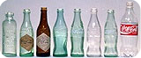
The creative bottles has set the brand too. During the beginning, the biggest challenge was the packing consistency that was almost same among all thousand beverages competitors. It is during 1916, the contour bottle is approved. This distinctive bottle today can be recognized even among plenty of other beverages packed.
The timeline of happiness drink:
1887-1890 – The birth of the trade mark
The trademark registered” words at the curved ‘C’ tail is the cherry on the cake.
1890-1891 – The little more turns
The next year, the logo changed its flavor with an extra swirl. Just for a change. Though later the logo returned to how it is born.
1941– the tweaked tail
The words ‘Trademark Registered’ crawled from the ‘C’’s tail to the bottom of the logo as ‘Reg. US Pat Off’.
1958 – Another change
This time, the Archiform was introduced to the world.
1969 – The white wave that moved the world
The white wave below the Coca-Cola logo became very iconic. It is also known as the ‘Dynamic Ribbon Device’. The wave can still be seen in the present logo.
2003 –The real
This logo came along with the ‘Coca-Cola…Real’ campaign. The floating bubbles and the enhanced white wave made the logo more vibrant.
2007 – A simple design
A very simple but valiant logo with the outstanding white ribbon ruled for the next four years.
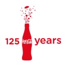
2011 – Celebrating the 125 happy years
This logo is introduced to celebrate the 125 years of Coca-Cola. The bubbles burst out from the red bottle. This depicts the happiness that we have been celebrating in the past, will in the future and right now in the present.
Well, there is more to ‘Wow’ about Coca-Cola. It is just the brand that carried it to across 200 countries around the world. It is during 1985 that Coca-Cola is noted as the first soft drink used in space. Each bottle of Coca-Cola undergoes around four hundred and fifty tests to make sure every drop has happiness and quality in it. ‘The pause that refreshes’ is one of the best advertising campaigns of Coca-Cola that appeared first in an evening post during 1929. It is admired and remembered even today. What a history that still appreciates the triumphant future!
All Intellectual Properties referred on this website are absolutely owned by their respective owners.